Liana, 29
Manager
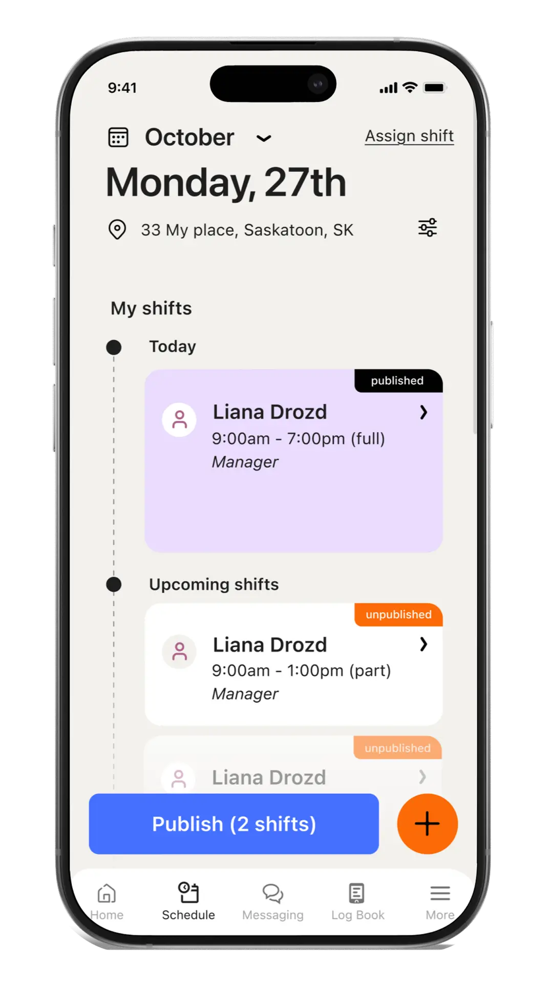
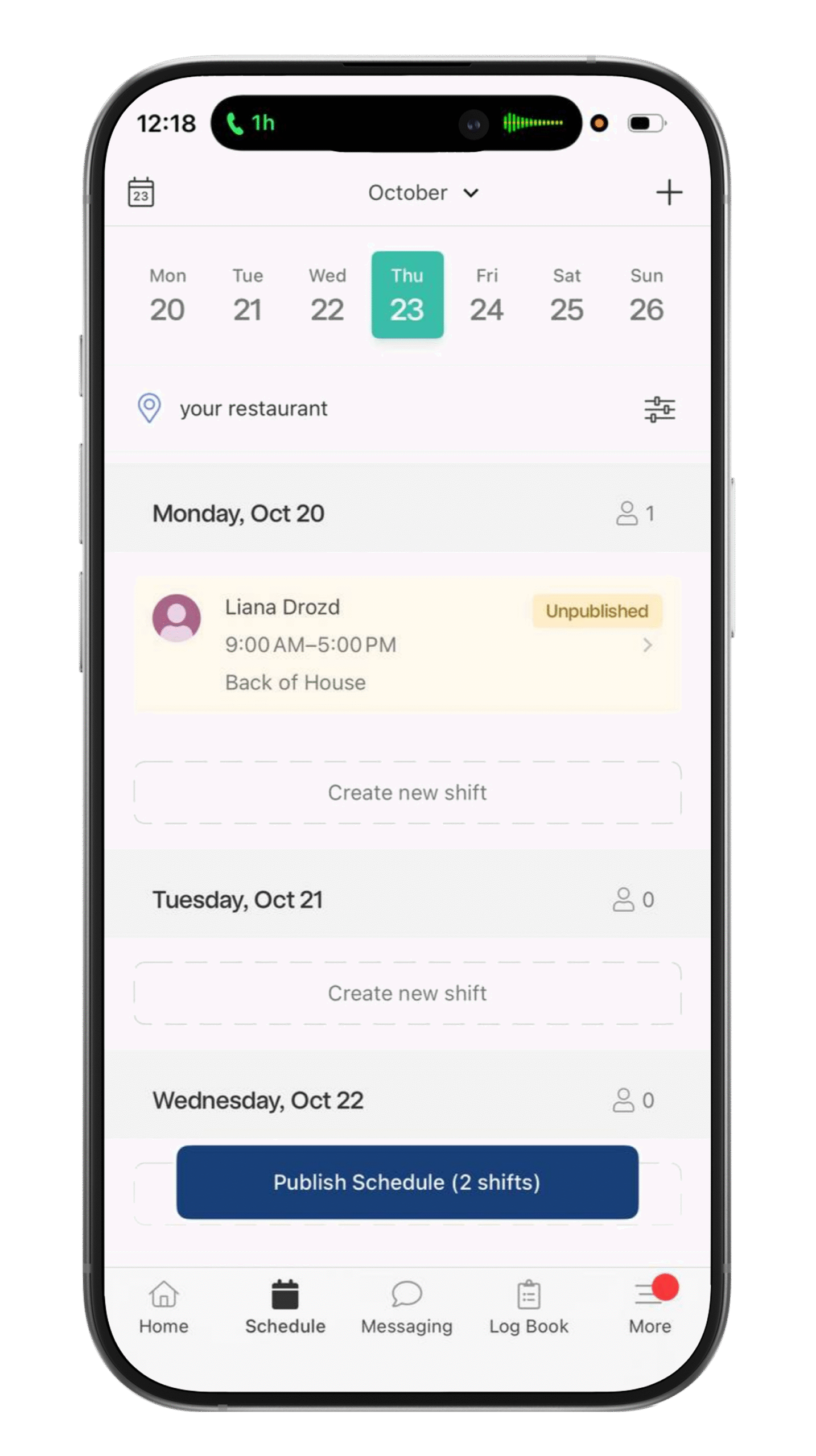
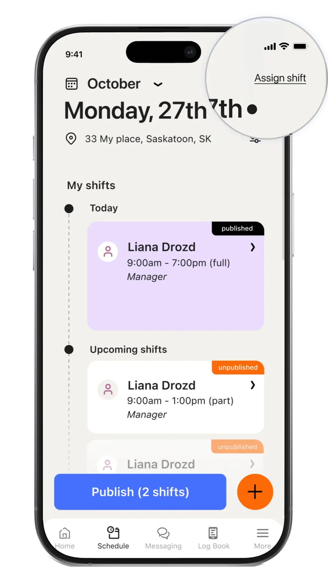
As a manager who regularly uses 7shifts, I often find it difficult to quickly identify which employees are available for open shifts.
Jessy, 47
Server
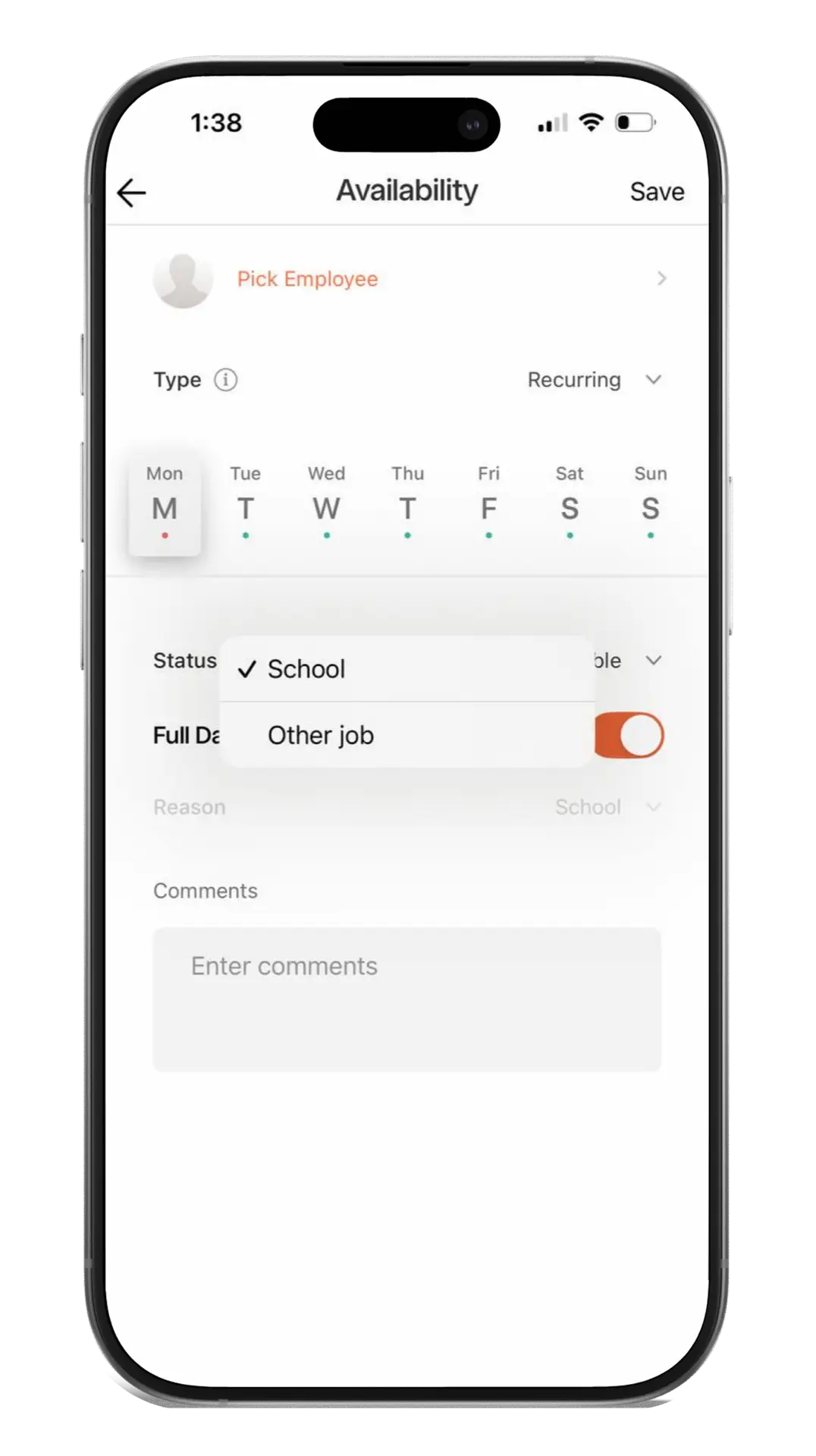
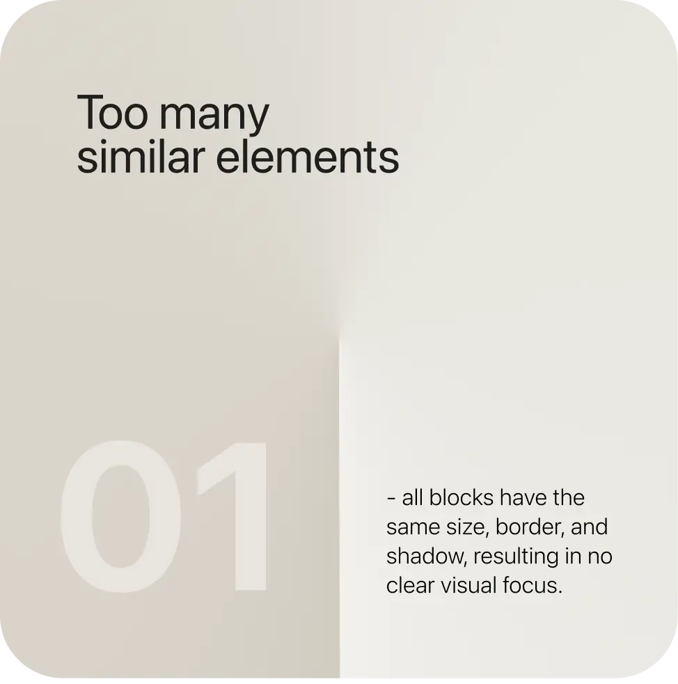
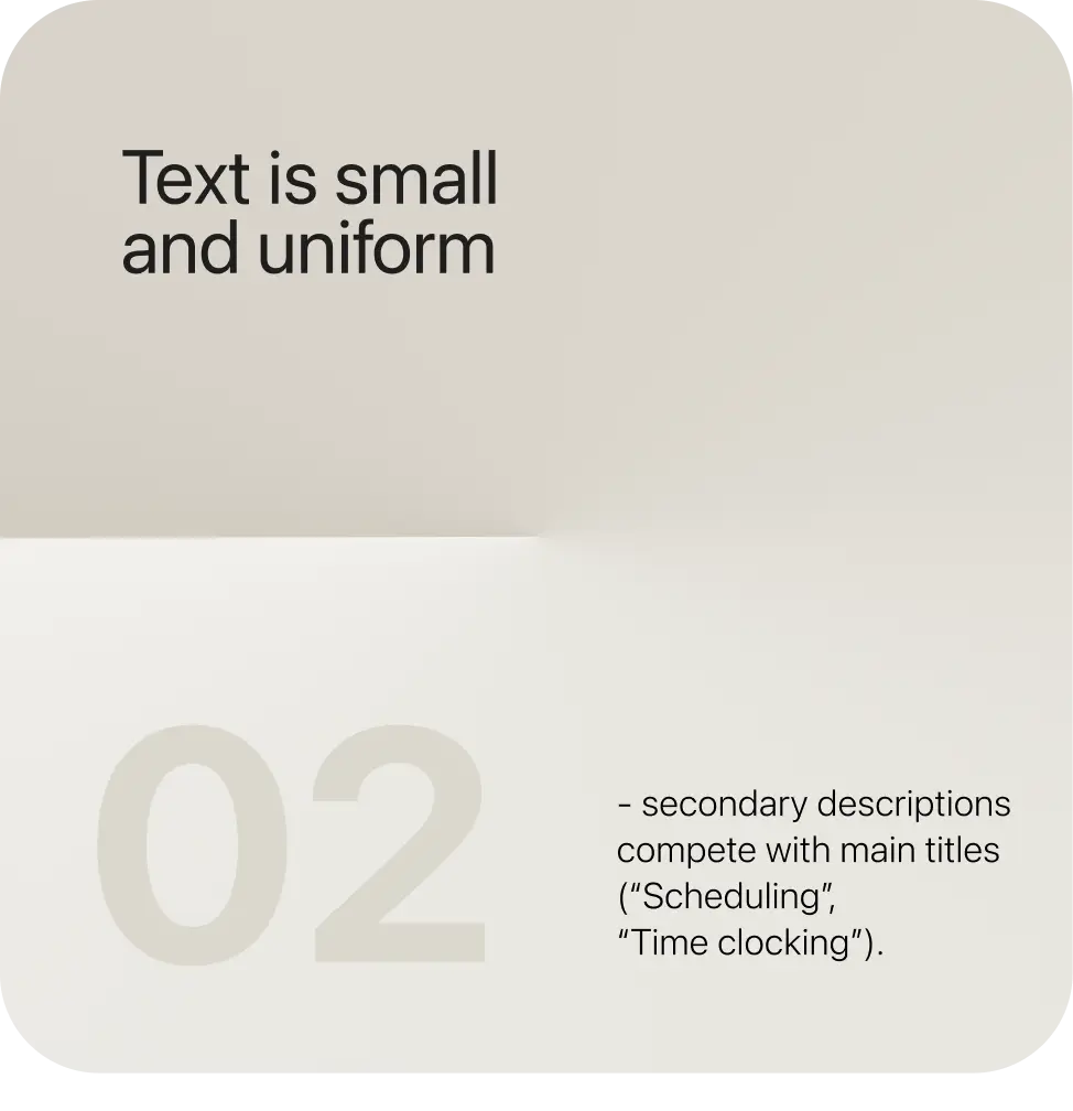
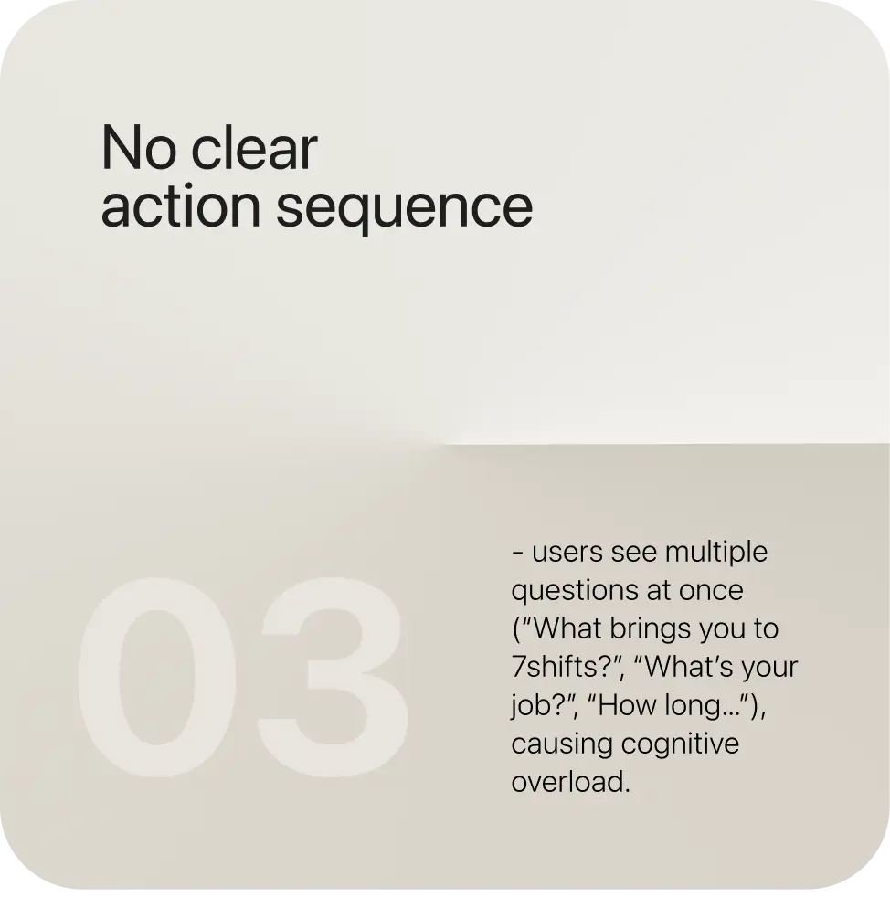
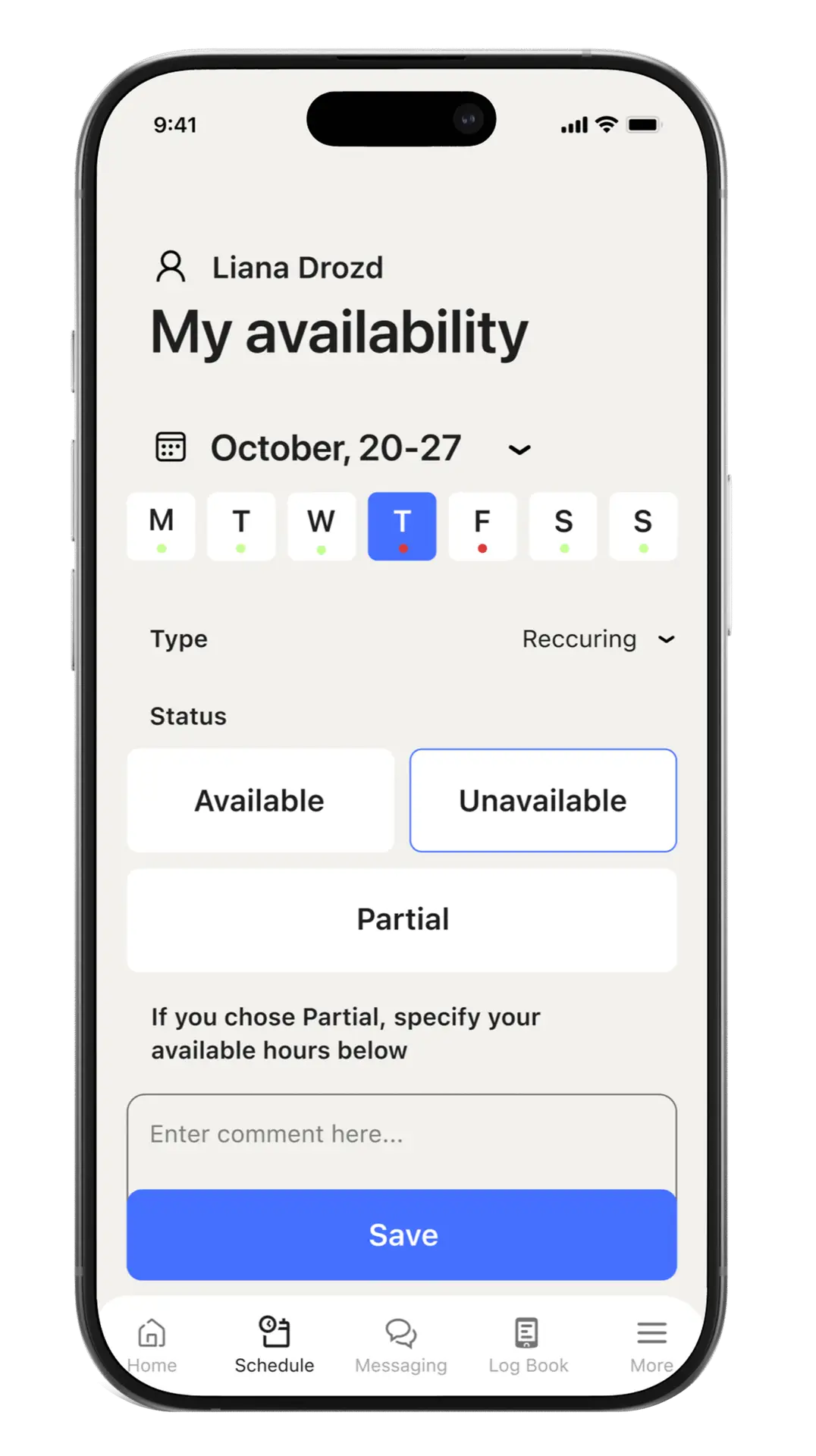
As an employee who frequently use an app, I want a clearer visual hierarchy so I can make changes faster and with fewer clicks.
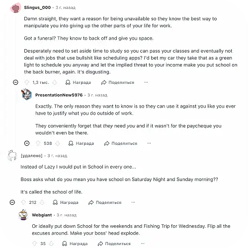
As an employee who frequently uses the app, I want to maintain the privacy of my personal life outside of work hours.
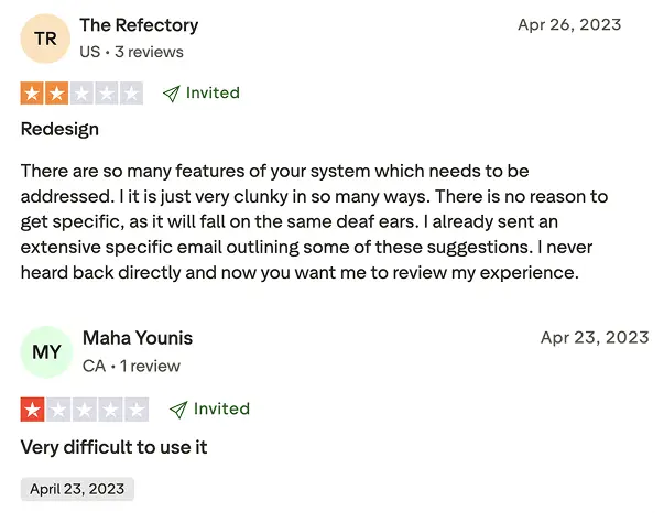
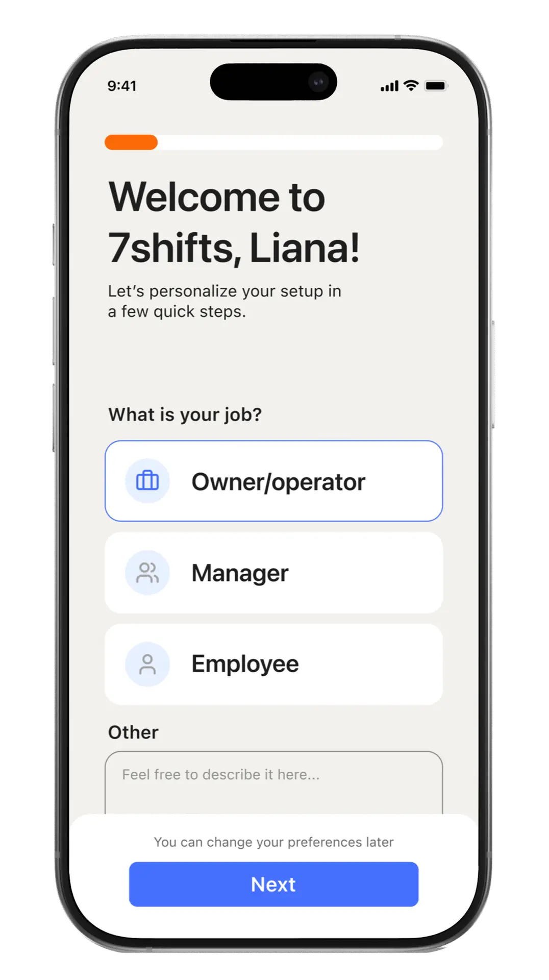
As a new employee, I find it very difficult to navigate the app interface.