Web Design & WordPress Development | website
x-bees: marketing website for a SaaS platform
expertise
Web Design
methods
Design Thinking
duration
2 months
year
2025

What is the project about?
About:
x-bees is a SaaS sales communications platform that helps businesses convert more leads into customers through a unified channel for chat, voice, video, scheduling, and AI-powered assistance. My task was to design and develop their marketing website — a digital showcase that communicates the value of the product, reflects its innovative character, and drives conversions.
Goal:
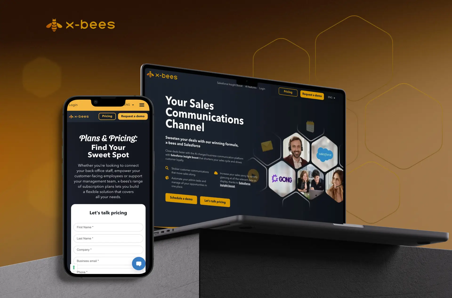
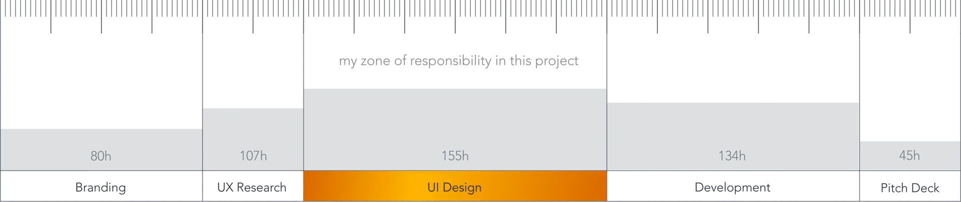
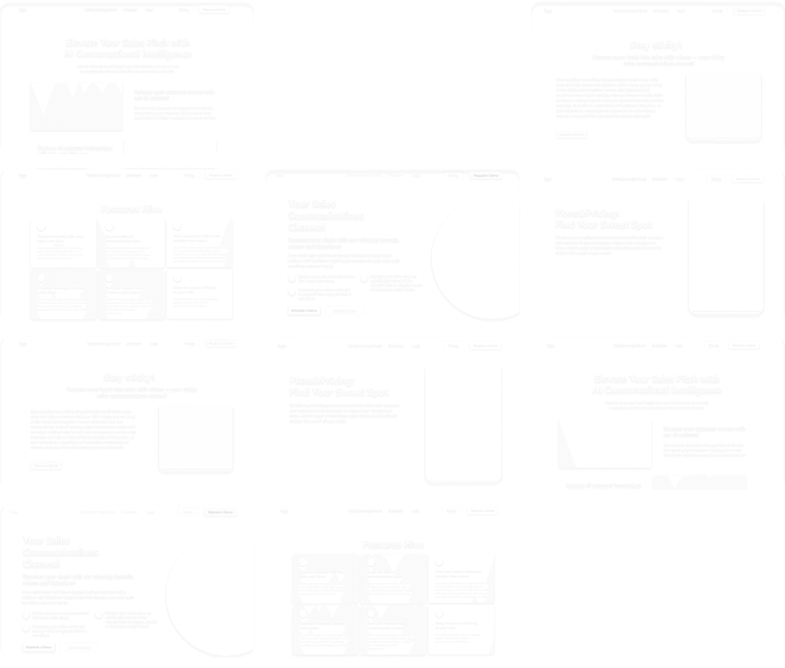
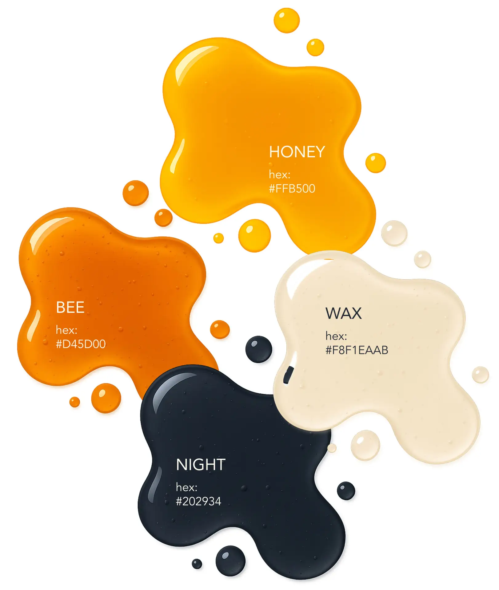
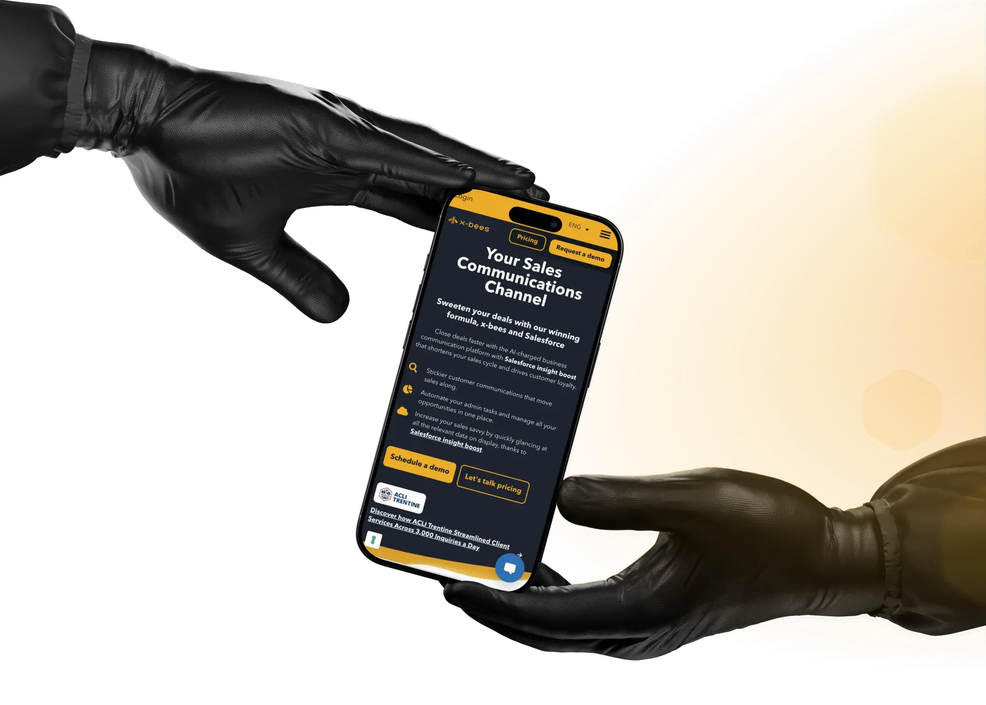
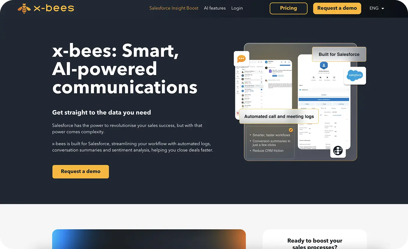
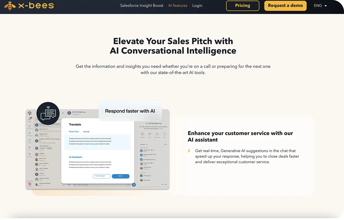
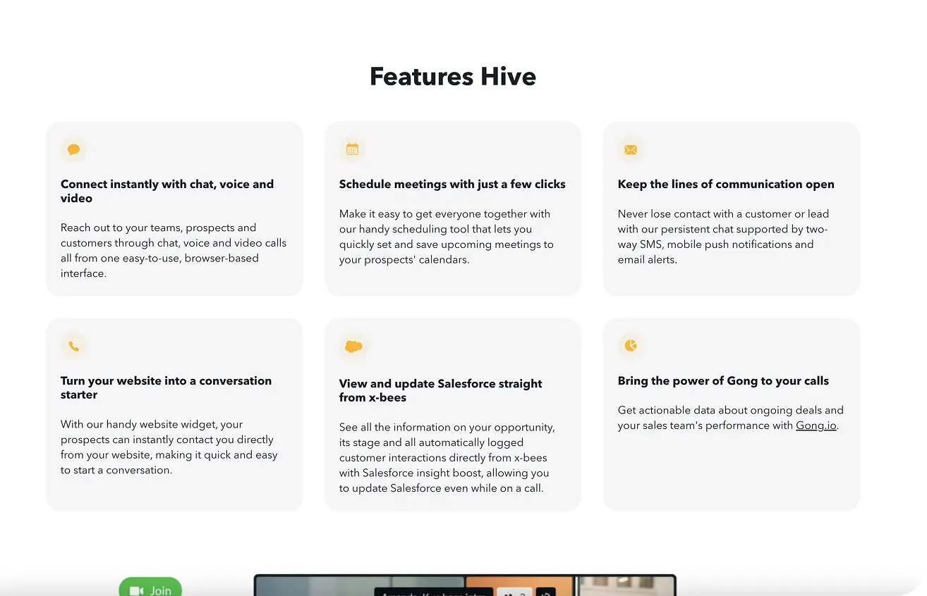
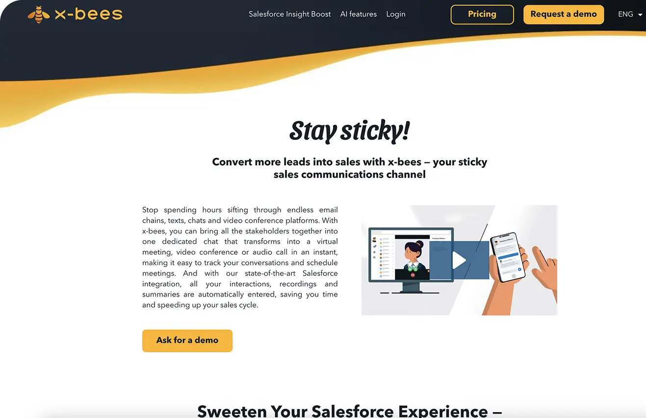
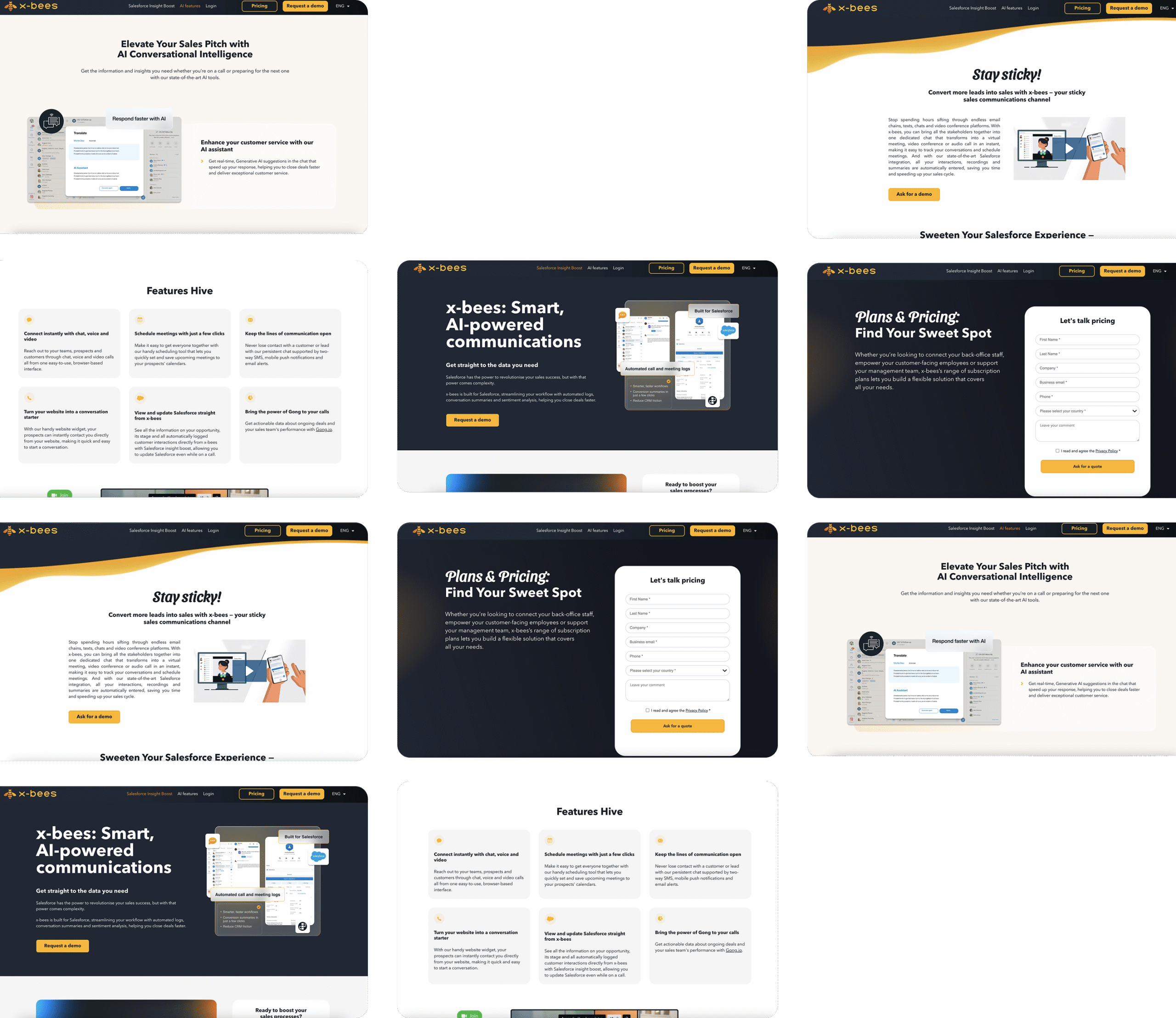
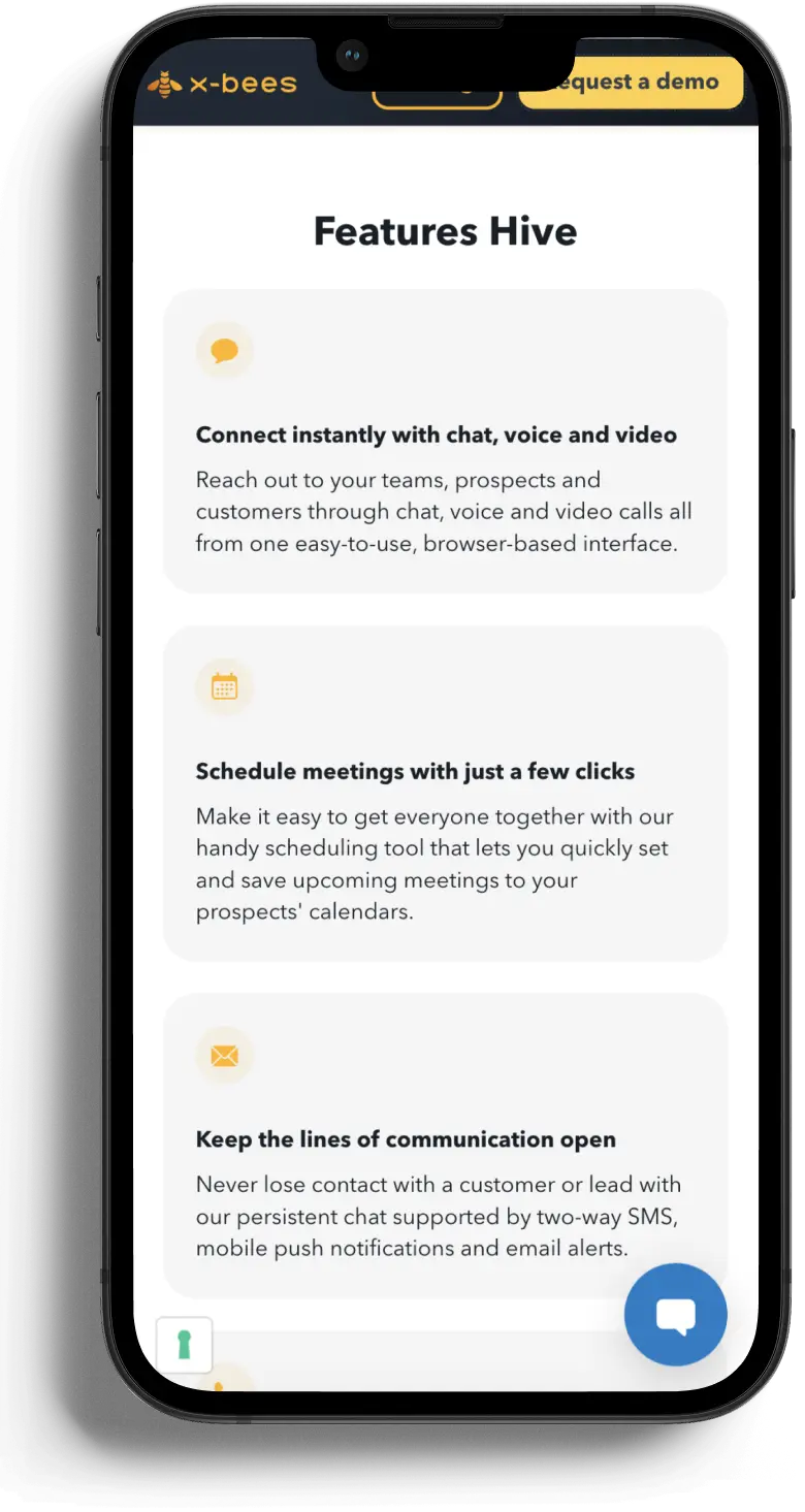
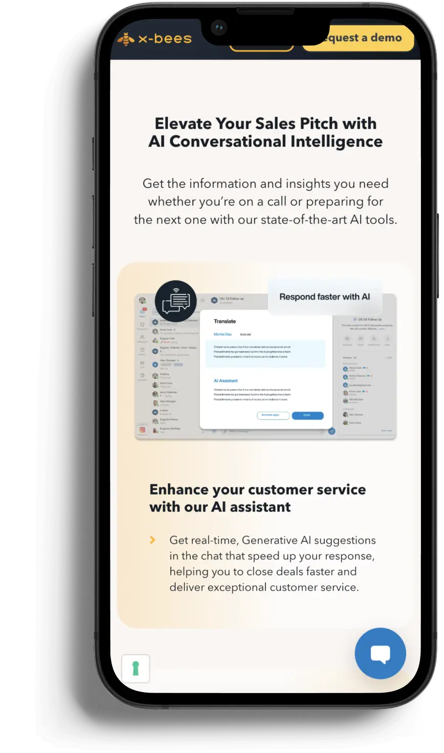
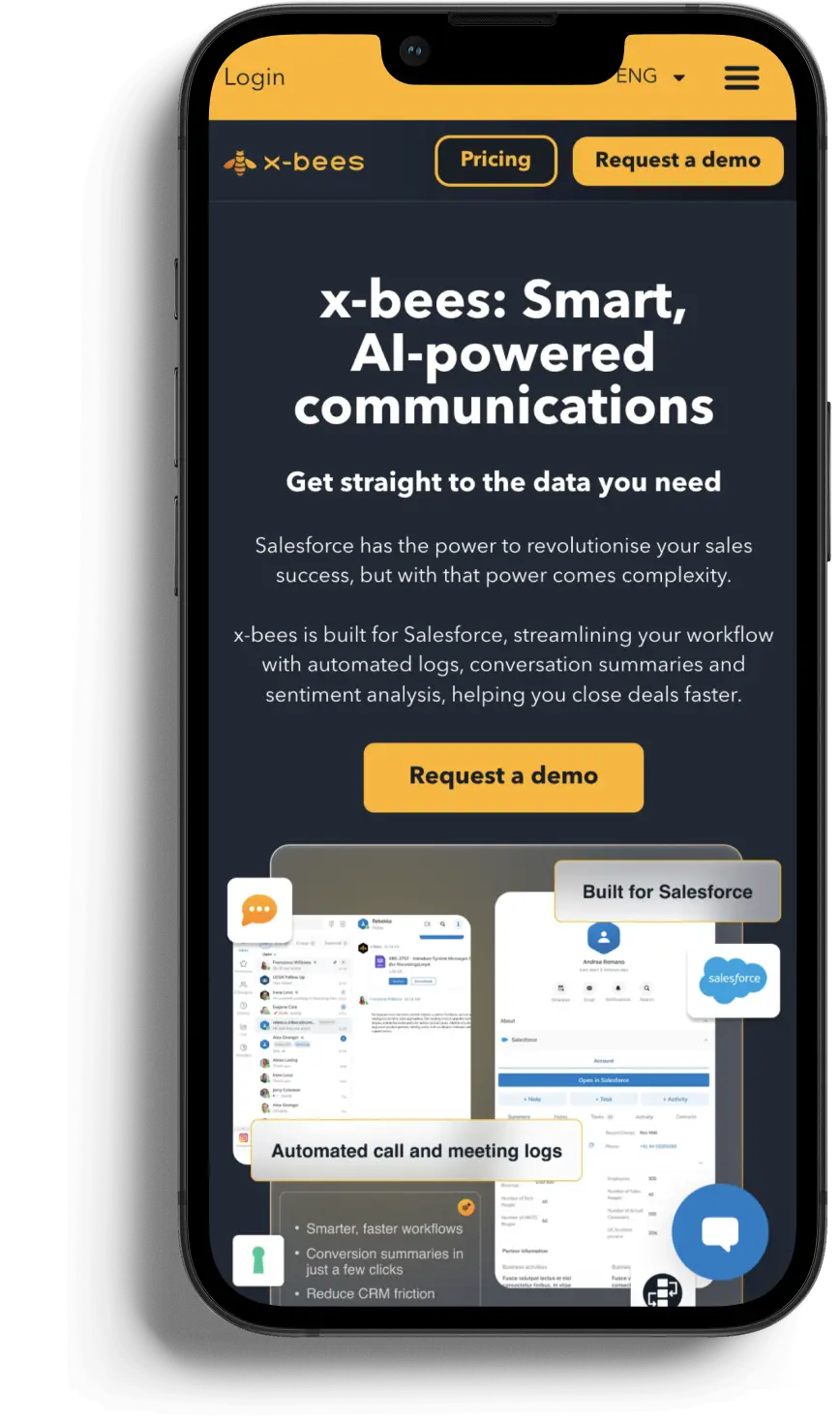
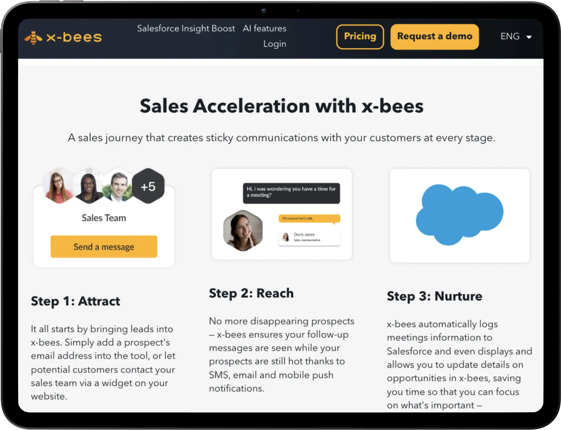
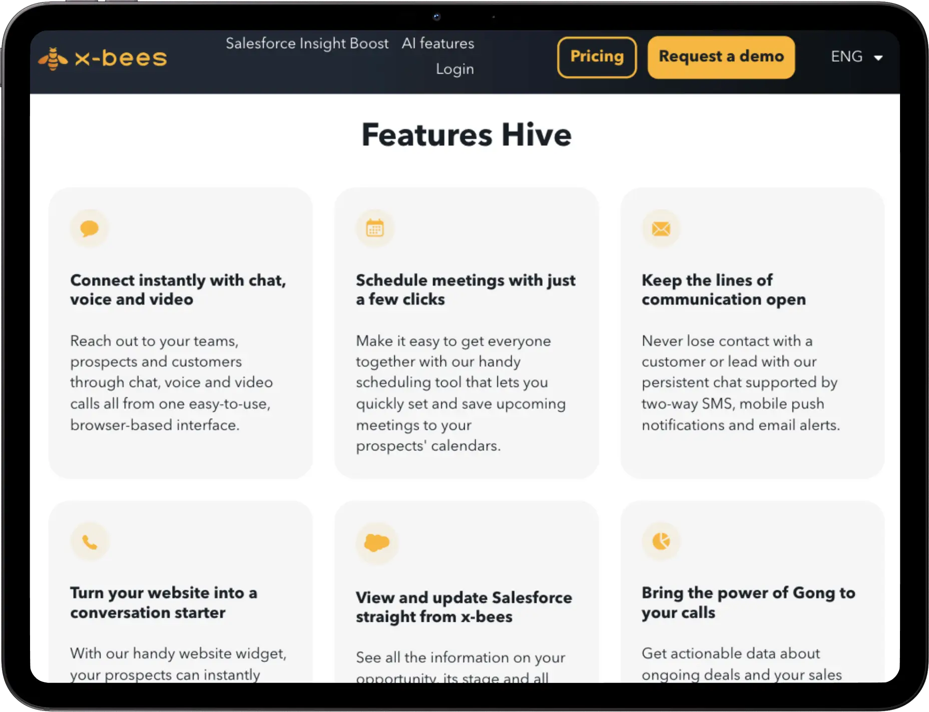
The goal is to distinguish the brand from competitors through a bee. The advantages of the x-bees are like bees in a hive, so the design needs to convey this idea, to balance modern, dynamic visuals with a clean structure that explains features such as Salesforce integration, AI-powered responses, and persistent communication. At the same time, the website had to perform flawlessly, be scalable, and highlight the product’s benefits for sales teams.


Brief overview of the mobile app
x-bees is a unified mobile solution designed to streamline sales communication and collaboration. It brings together messaging, video calls, customer service, and business tools in one app, helping teams stay connected and work more efficiently.
Design process
It was a very large-scale project involving entire teams, here’s what it roughly looked like on the timeline.

Wireframes
For x-bees, we focused on clarity, simplicity, and a sense of connection. Rounded shapes and soft visuals created a friendly, hive-inspired atmosphere, reinforcing the idea of seamless teamwork — just like a swarm of bees working together. Clean layouts and white space made the content easy to follow, while the modular grid kept everything structured and consistent. Interactive elements and clear CTA buttons ensured smooth user flows, resulting in a modern, intuitive design that feels both professional and approachable.

Typography
Avenir
{ light / book / heavy }
The primary typeface, used for body text and subtitles. Its clean, modern lines and versatile weights ensure readability and create a professional foundation for the overall design.
Sansita
{ bold italic }
The accent typeface, reserved for headings. With its bold italic style, rounded curves, and expressive character, it adds a friendly and dynamic touch that balances the clarity of Avenir with a more emotional voice.
Colors


UI layouts
The result is a clean, easy-to-understand, conversion-focused website for x-bees, designed to showcase the product’s value at every stage, from core features to pricing plans. The layouts combine a modern visual with a clear structure and a beehive concept, seamlessly guiding users to action and setting the brand apart from the competition.


Solution

– developed a unique visual language with clean layouts, intuitive navigation, and dynamic illustrations that highlight the innovative nature of the SaaS platform.

– built a logical user journey: from product introduction and key features (AI assistant, chat, video, Salesforce integration) to pricing pages and clear calls-to-action.

– ensured full responsiveness and fast performance across devices, laying the foundation for scalability and the brand’s future growth in the SalesTech market.