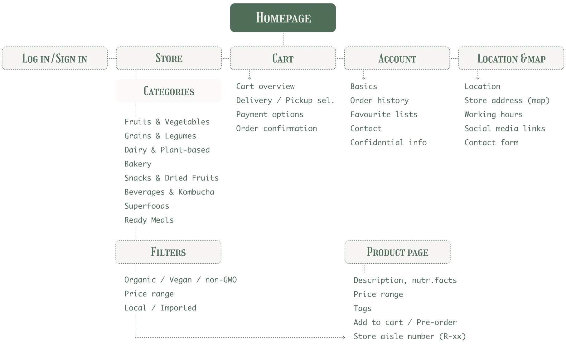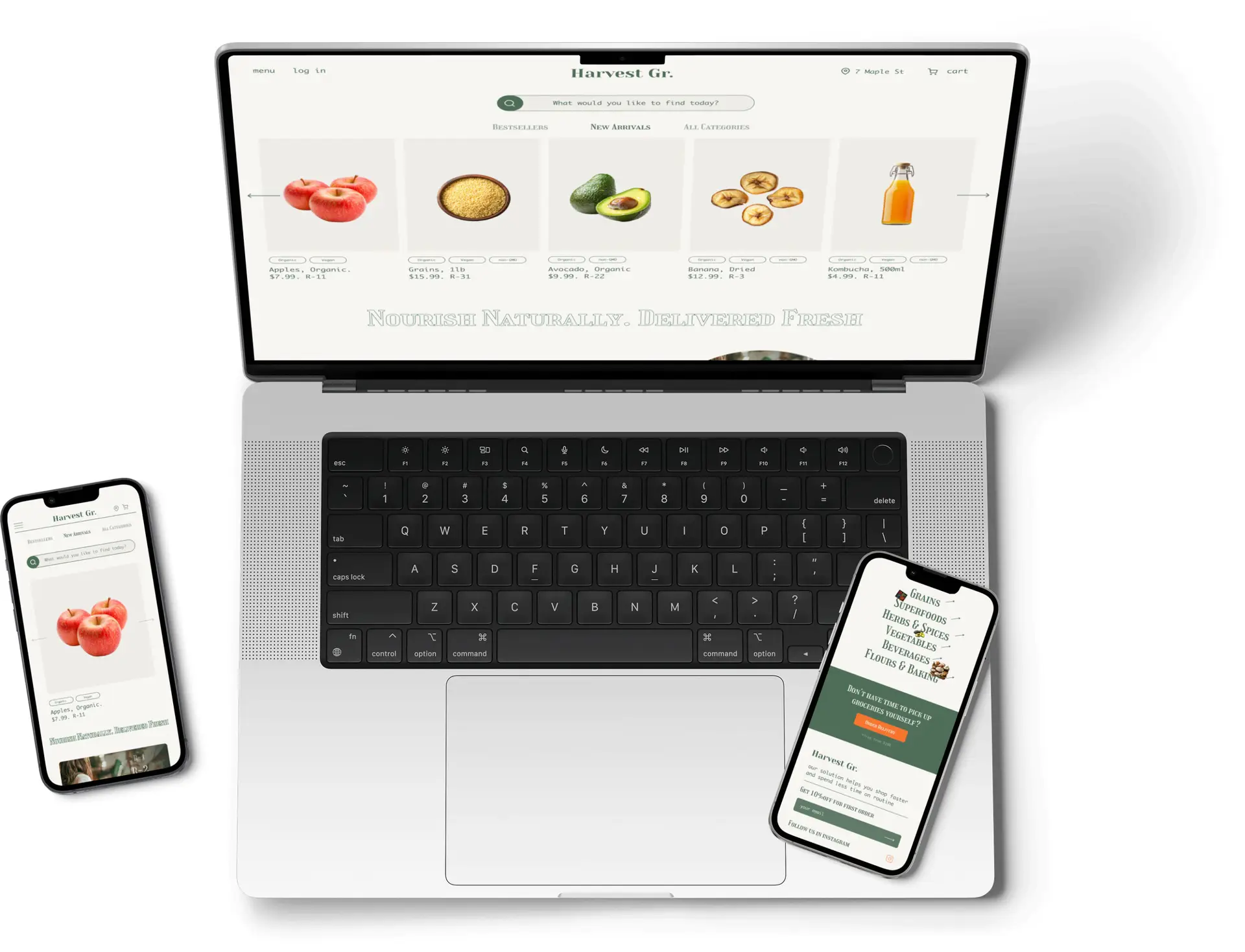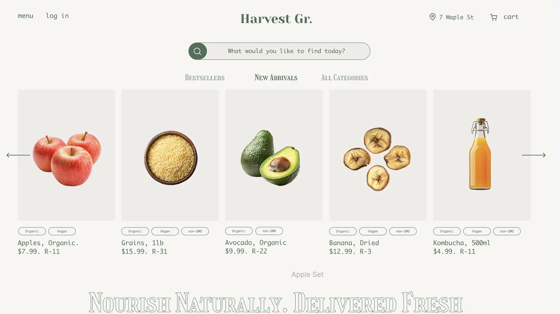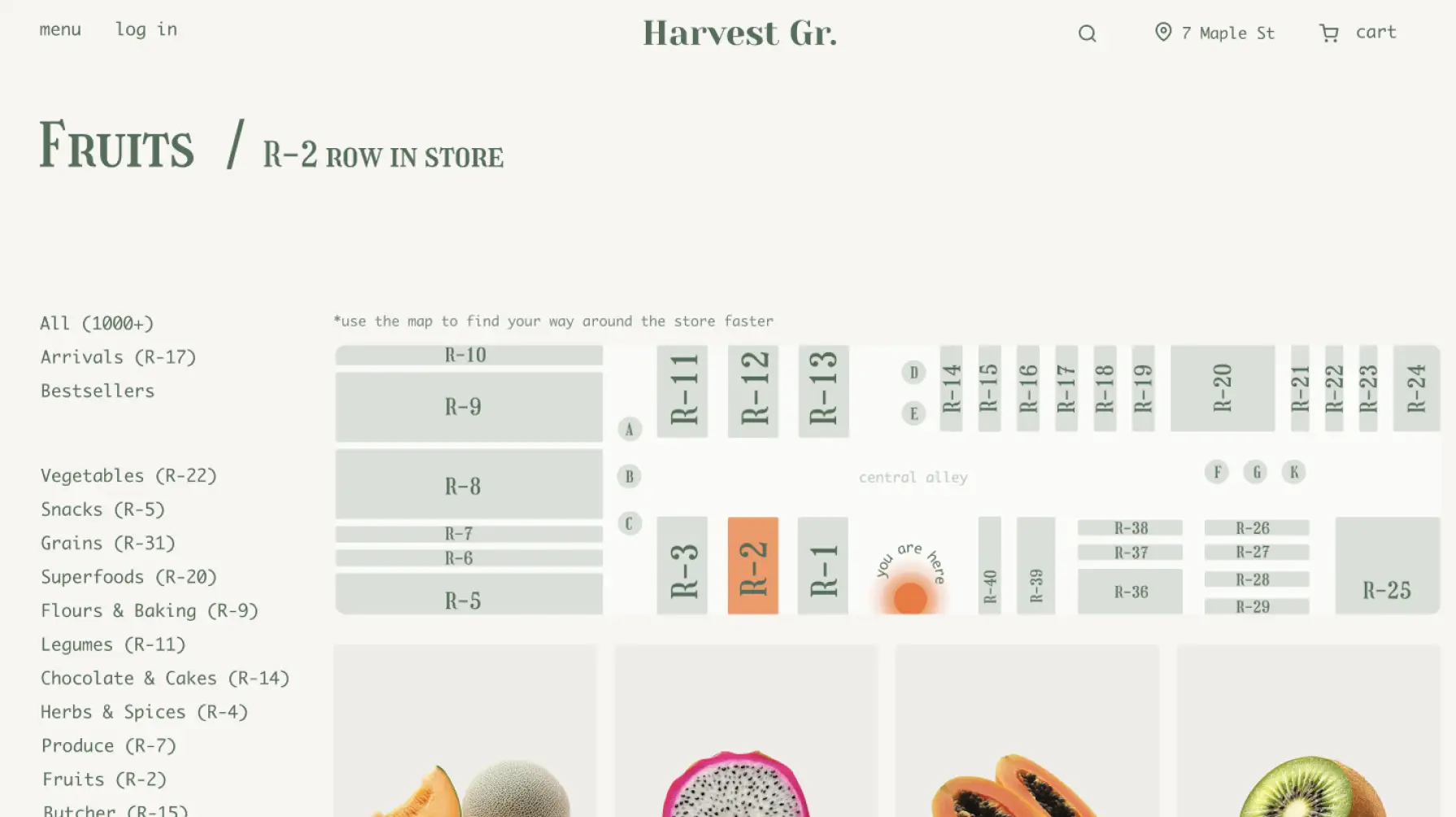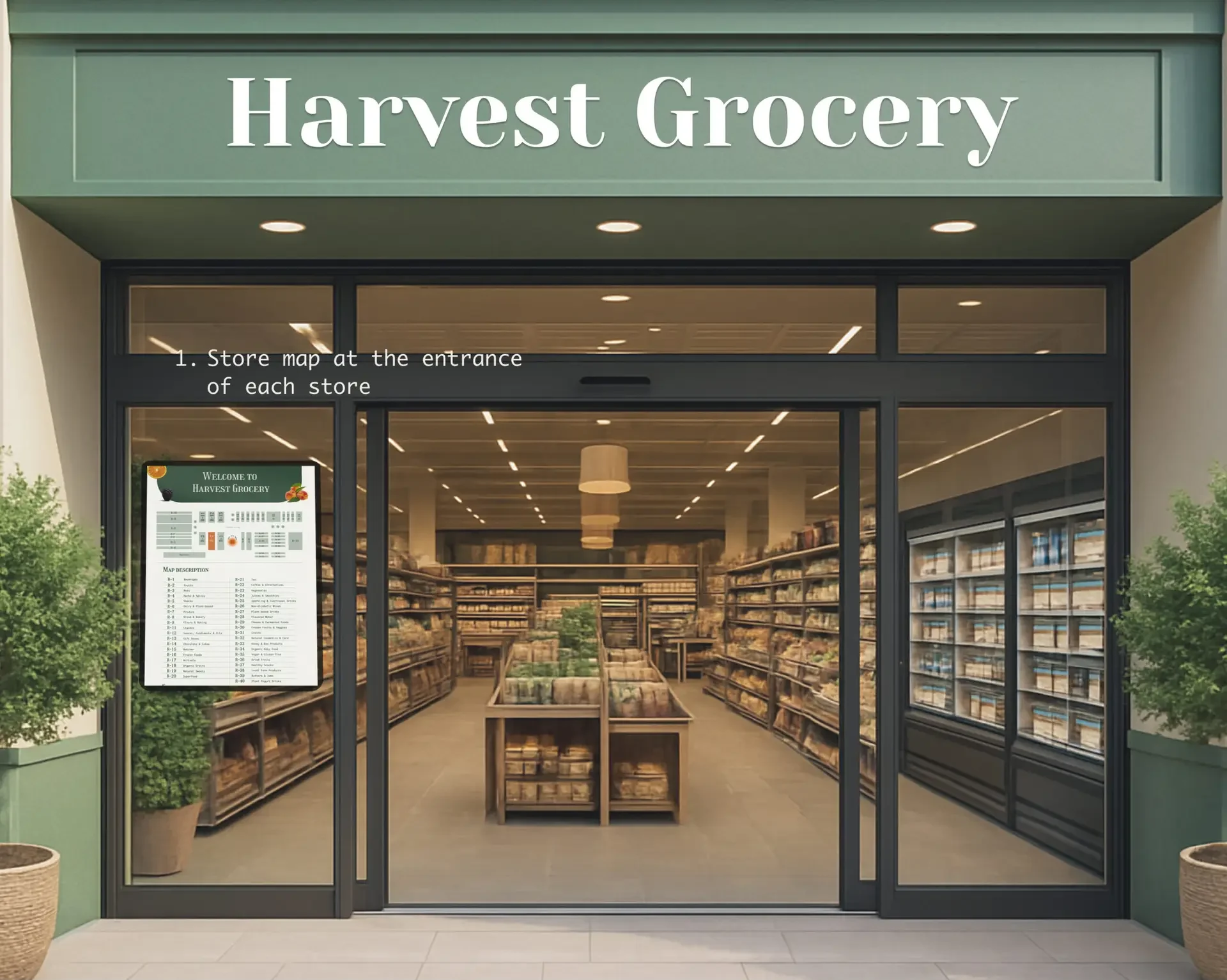
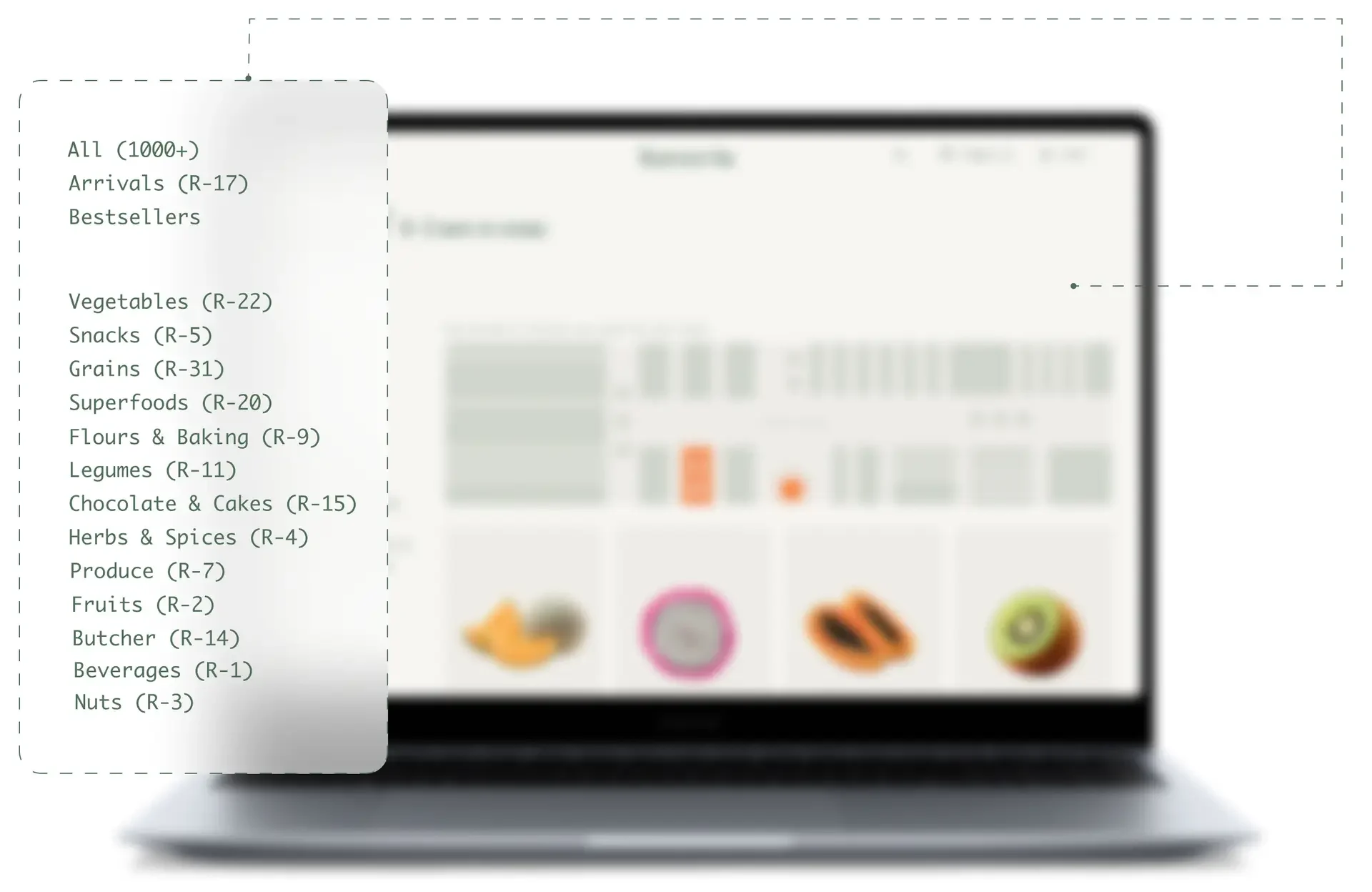
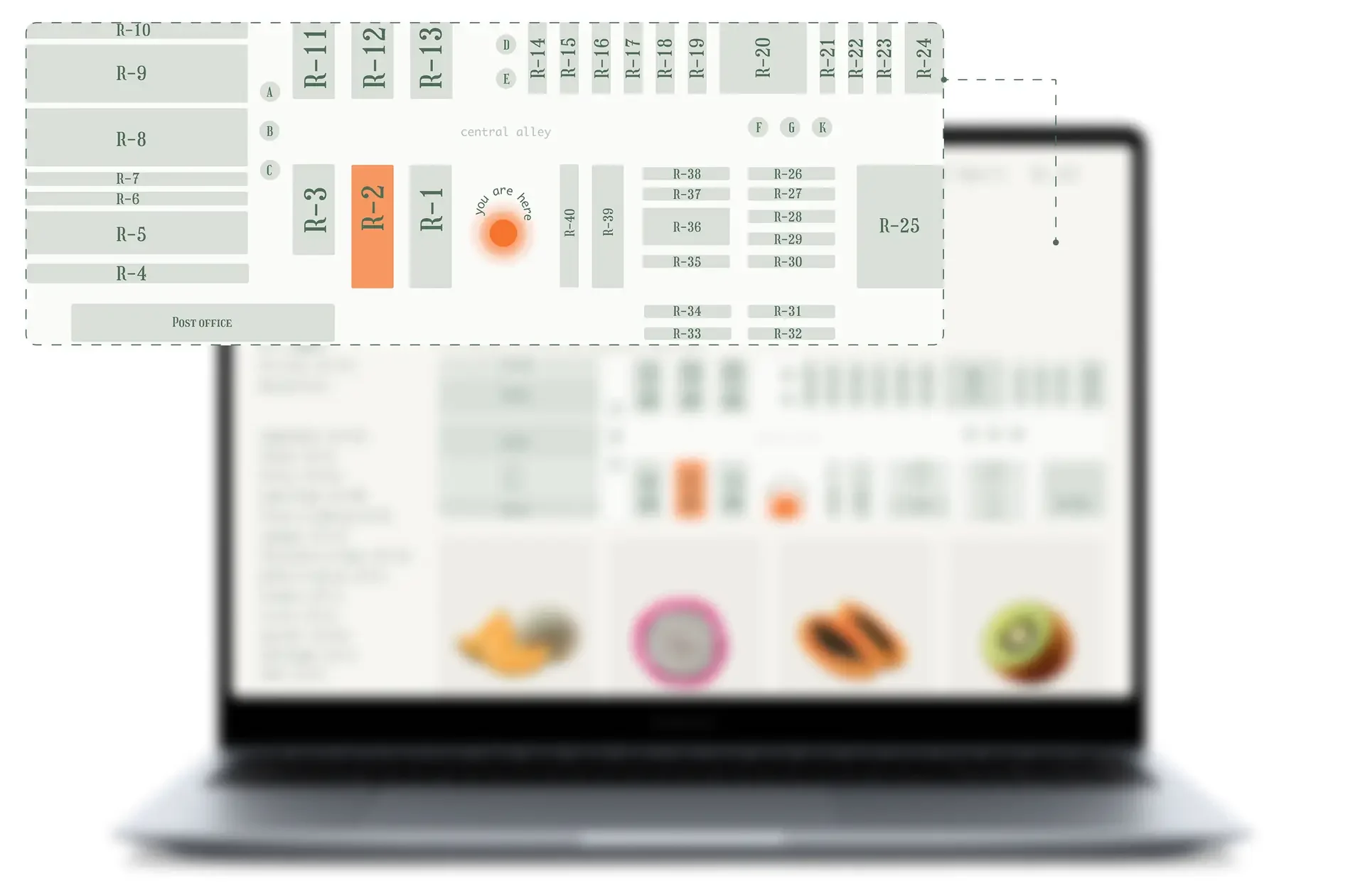
"I always plan my grocery shopping in advance. The only difficulty is that if it’s a new store, I spend a long time searching for the right product. What makes my shopping experience pleasant is knowing exactly where each product is located. It would help a lot to have clear pictures and signs showing where certain departments are."

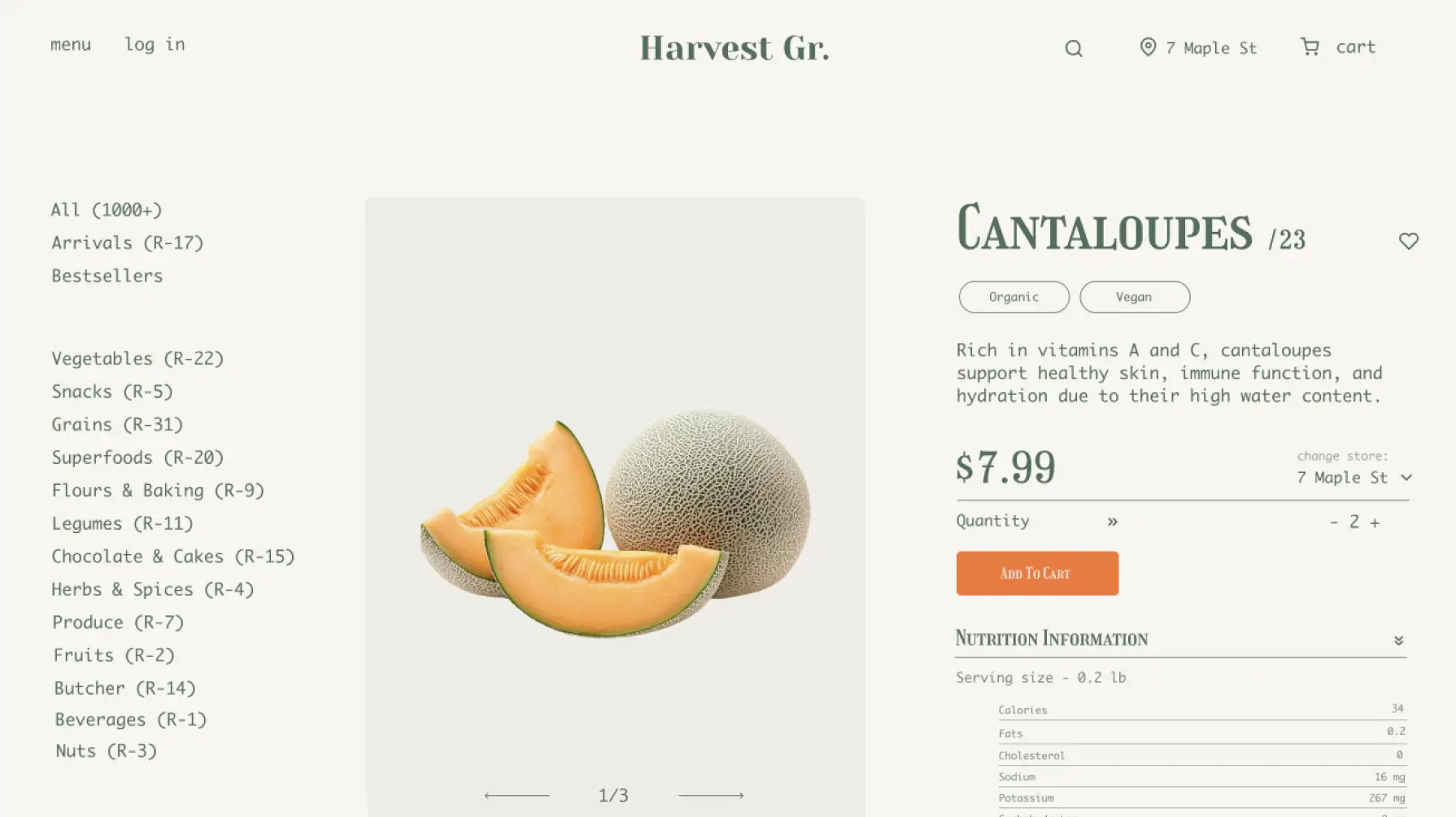
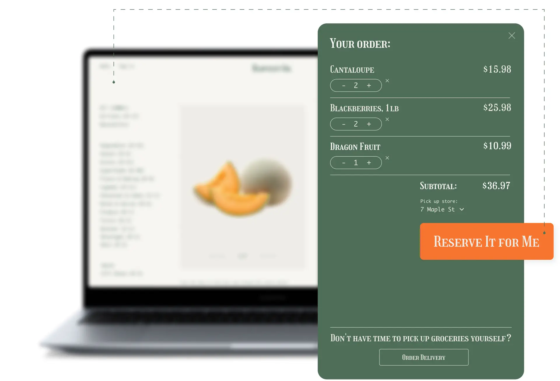
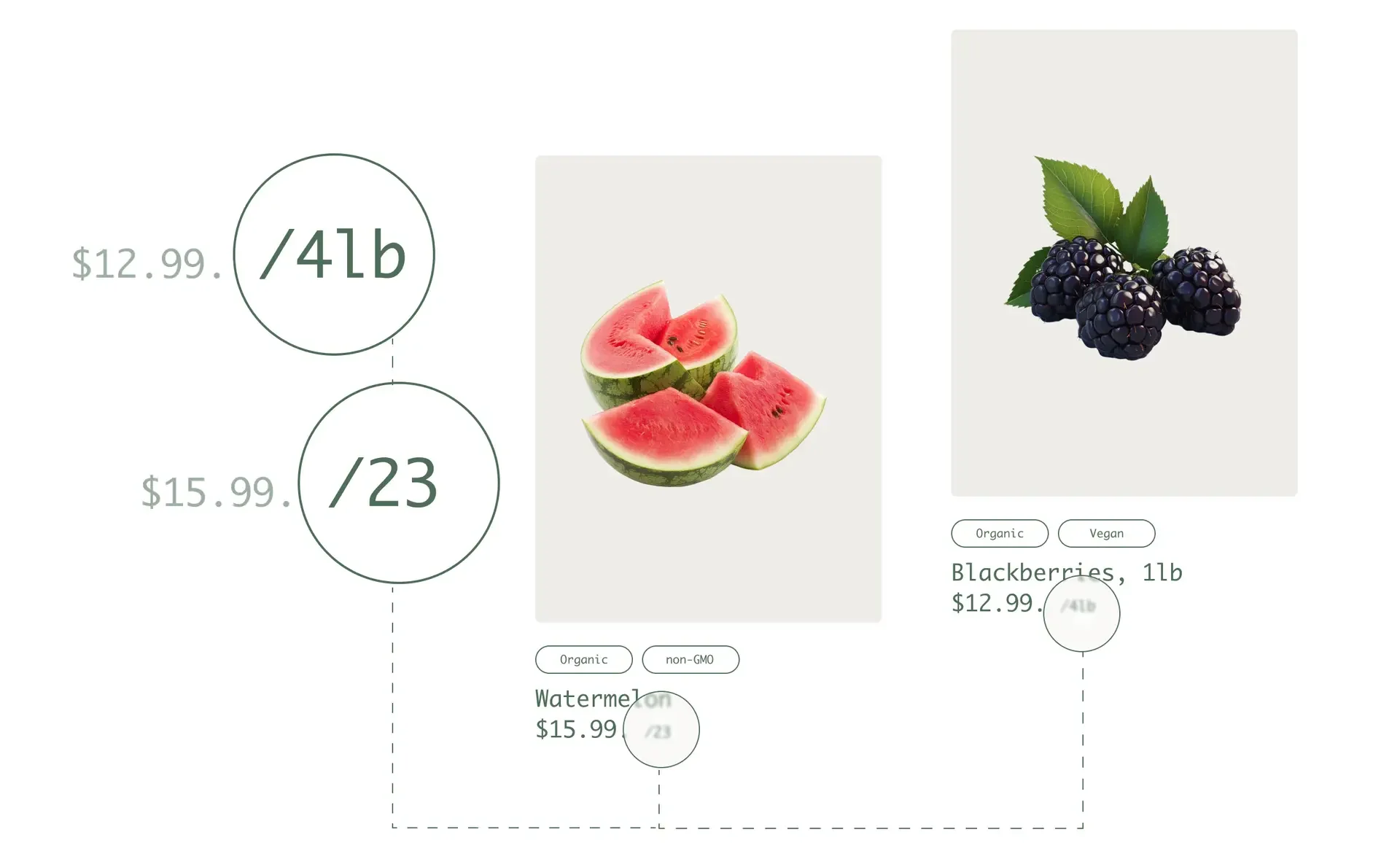
"I shop several times a day, but sometimes it’s spontaneous. The biggest challenge is that vegetables aren’t always fresh, and I often have to spend 20 minutes picking through to find good ones. For me, shopping is sometimes stressful because I’m spending money, so I like to treat myself with something sweet and healthy. It would be easier if there was a way to search for products by their location in the store."

"I don’t shop very often, and when I do, I usually have a rough idea in my head of what I need. My main issue is when something is missing, or it’s only available in specific supermarkets. I really value cleanliness and fresh products, and I like when the store layout is logical so I can find everything intuitively. In Portugal once, I had trouble finding hummus, so clear signs would be very helpful."


Farm Boy
Whole Foods
Goodness Me
Warry Watch